1. System 1 and System 2
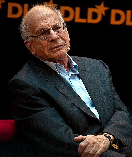
Kahneman introduced two ways our brain processes information:
System 1:
This is fast, automatic, and emotionally driven thinking. It’s responsible for intuitive decisions and first impressions.
System 2:
This is slow, analytical, and logical thinking. It comes into play when we consciously think about a problem or make a complex decision.
Application in Web Design:
When designing a website, you must consider both systems. The first impression a user gets from your website is dominated by System 1. This means that visual aspects like color, layout, and typography must immediately resonate with the visitor. Simple, intuitive navigation also appeals to System 1, allowing users to find what they’re looking for quickly and without much thought.
Application in Brand Building:
In branding and image creation, System 1 plays a significant role in how people feel and perceive your brand. A consistent and appealing visual brand, quickly recognizable, can build a strong emotional connection. System 2 can then be engaged through more detailed content, such as in-depth blog posts or whitepapers, appealing to the analytical side of your audience.
2. The Halo Effect and Anchoring Bias
Kahneman discussed several cognitive biases that influence our thinking, two of which are the Halo Effect and Anchoring Bias.
Halo Effect:
This is the tendency to extend a positive impression of one characteristic of a person or object to other, unrelated attributes.
Anchoring Bias:
This occurs when people rely too heavily on the first piece of information (the “anchor”) they receive when making a decision.
Application in Web Design:
The Halo Effect can be leveraged by investing in an impressive homepage or a strong visual element that creates a positive first impression. This positive impression can extend to the rest of the website, even if some parts are less strong.
Application in Brand Building:
Start with the most compelling benefits to influence the perception of the rest of your offerings.
3. Bounded Rationality and Choice Architecture
Kahneman also demonstrated that people often make irrational decisions due to limitations in their cognitive capacity, known as Bounded Rationality. People don’t want to be overwhelmed by choices, leading to Choice Architecture: the way choices are presented to encourage a specific outcome.
Application in Web Design:
Ensure that you don’t overwhelm users with too many choices or information. Minimalist design, clear call-to-actions, and simple navigation are crucial. By presenting the most important choices prominently and attractively, you can optimize the user experience.
Application in Brand Building:
In brand strategies, you can apply choice architecture by presenting your offerings in a clear and step-by-step manner. Start with a core product or service, then offer logical upsells or cross-sells. This reduces cognitive load and leads to higher conversion rates.
Conclusion
The principles from Kahneman’s “Thinking, Fast and Slow” can help not only psychologists and economists but are also incredibly valuable for web designers. By considering how people think and make decisions, you can design more intuitive, user-friendly websites and create brands that truly resonate with your audience. Applying these insights can also help you build a strong bond with your customers, ultimately leading to greater loyalty and long-term success.


